Develop responsive websites & apps with Polypane, a powerful browser. Create layouts for all devices simultaneously, offering unparalleled control and visibility.
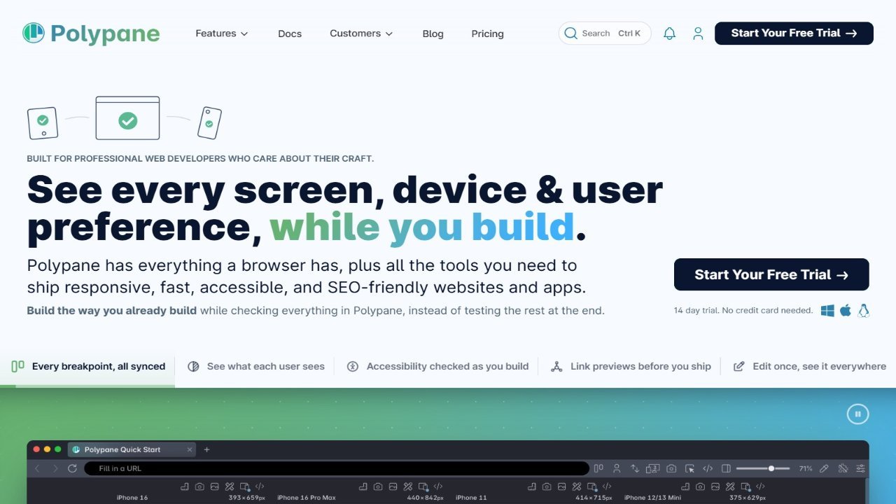
Polypane is a browser designed for creating responsive websites and applications across various devices and viewports simultaneously. It provides a comprehensive overview of your website’s appearance on different screen sizes, allowing developers to easily adjust layouts and CSS breakpoints without constantly resizing the browser window. Polypane features include synchronized panes, where actions in one pane automatically propagate to others, ensuring seamless navigation and interaction across all supported devices. Furthermore, it offers one-click screenshot generation for comprehensive visual verification, along with powerful devtools such as layout debugging and Chromium-based tools for efficient website and app development.