LT Browser: Debug your website’s responsiveness across 50+ devices! Test mobile & tablet views, use Dev Tools & create custom profiles. Ideal for responsive design.
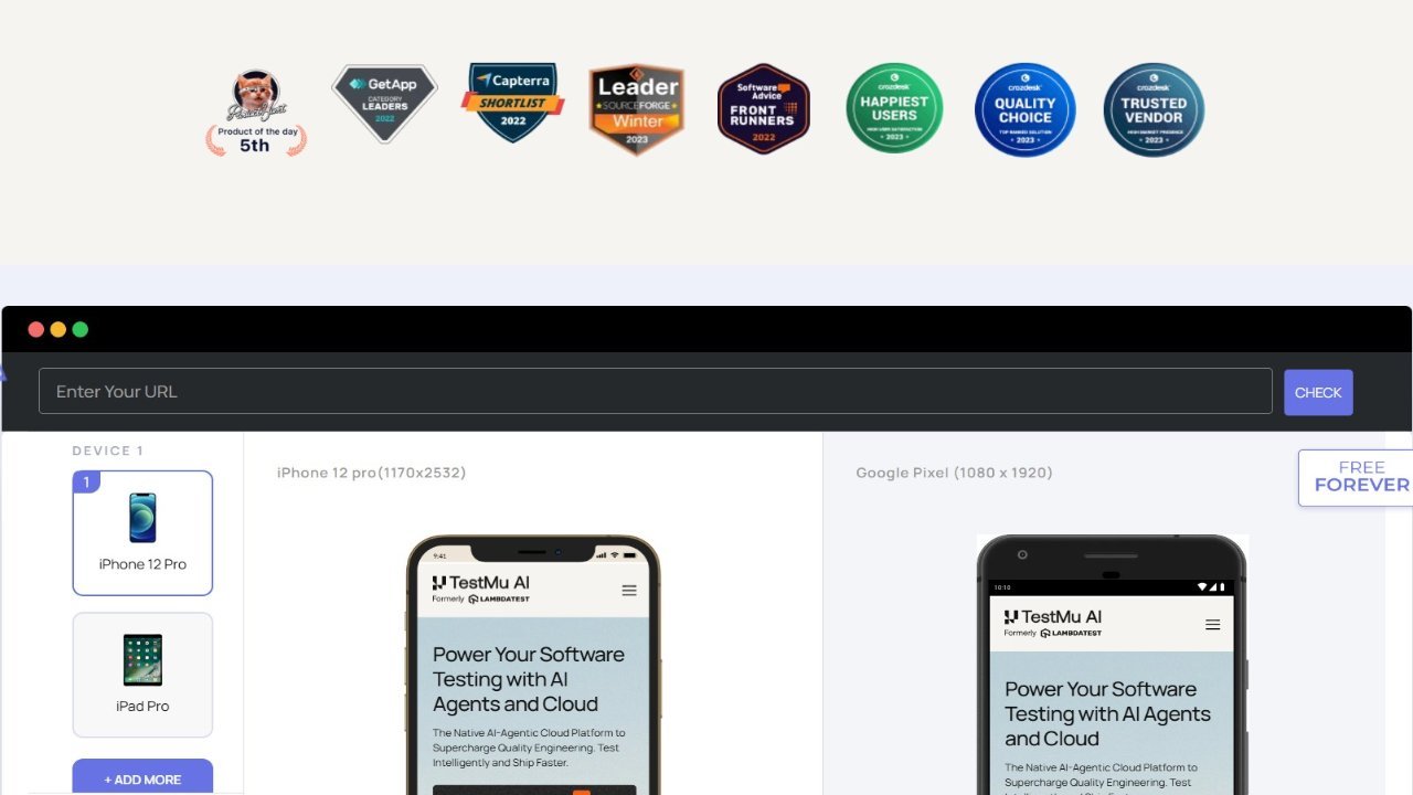
LT Browser provides a comprehensive solution for testing website responsiveness across a wide range of devices, including over 50 options. This allows users to easily simulate different screen sizes and resolutions, ensuring their websites are optimized for mobile and desktop viewing. Key features include the ability to create custom device profiles for future use, enabling simultaneous testing on various tablets and desktops with different resolution settings. LT Browser also includes Dev Tools, providing dedicated debugging capabilities for each device during responsiveness testing. This eliminates the need to switch between devices and allows users to simultaneously inspect and test their websites across multiple resolutions and screen sizes, ensuring a seamless user experience regardless of the device used.